Designing Unibuddy’s new ambassador mobile app
Helping student and staff ambassadors to manage conversations & create and share content with ease
When
Nov 2023 - Jan 2024
Product
Unibuddy’s Ambassador App (Mobile)
Team
Solo designer working alongside a PM, EM, and a squad of five engineers

TL;DR
I led the end-to-end design of a brand-new mobile app for university ambassadors. Improving usability, reducing complaints to zero, and driving a 300% increase in engagement.
My role
Sole product designer responsible for user research, UX strategy, wireframes, UI design, prototyping, and partnering with developers to ensure smooth handoff and high-quality implementation.
Impact
300% increase in ambassador engagement
User satisfaction score of 8.2
Zero complaints after launch
INTRODUCTION
Company objectives
Unibuddy’s existing app was shared between prospective students and ambassadors, but it suffered from frequent bugs, poor usability, and a low App Store rating. At the same time, Unibuddy had launched a separate student app for a different use case. To simplify the experience and better support each audience, the company made a strategic decision to merge the student apps and spin off a dedicated ambassador app.
To better serve our users and improve product quality, my squad was tasked with designing and delivering this new ambassador app — focused on messaging, content creation, and a seamless user experience.
Key results
Reduce ambassador app complaints to zero
Increase monthly active users (MAUs)
Achieve a user satisfaction score of 7+
Improve ambassador response rate & time
Transition 100% of ambassadors to the new app
Old ambassador app
The previous ambassador app included the essential features: messaging, content tools, and notifications; but the experience was buggy and frustrating to use. While we had some feedback from users, it lacked depth and clarity. To identify the key pain points and uncover new opportunities, we kicked off a round of targeted user research.

QUALITATIVE USER RESEARCH
Goal
Understand ambassadors’ current experience in order to make informed design decisions for the new app. Particularly around messaging, usability, and content creation.
Research objectives
Explore how ambassadors currently use Unibuddy on both mobile and desktop
Identify major pain points with the existing app, as well as aspirations for a new experience
Understand their perceptions of Unibuddy’s content tools, their role at their university, and their interest in creating short-form content
Participants
I interviewed 12 ambassadors via Zoom, aiming for a diverse mix across geographies, education levels, and experience with the platform. This helped ensure we captured a broad perspective on what works, what’s broken, and what’s missing.
Key insights
🔧 App stability & performance
Frequent bugs: crashes, freezing, delayed message loading, and login issues
App often logged users out unexpectedly
Unable to send longer messages (text box would freeze after multiple lines)
💬 Chat experience
Desire for richer chat features: emoji reactions, image sharing, reply functionality, and support for formatting (e.g. bold/italic)
Frustration with organizing resolved chats and searching past messages
Requests to send clickable links and receive more context about prospects before chatting
📹 Content creation
Ambassadors were interested in creating short-form content but found the existing tools unintuitive
Wanted simpler interfaces and support for video content
📬 Notifications
Current email notifications were seen as spammy or irrelevant
Preference for summaries like: “Here’s what you missed” rather than individual message pings
⏱️ Time tracking & recognition
Issues with the accuracy of time tracking features
Some interest in receiving feedback or performance ratings from prospects after chats
INFORMATION ARCHITECTURE
With a clear understanding of ambassador needs, I began shaping the foundational structure of the new app. The first step was defining a logical and intuitive information architecture, critical for helping users navigate with ease, discover features quickly, and ultimately stay engaged.
Although we wanted to improve the experience significantly, we also knew it was important not to completely reinvent the structure. Keeping familiar patterns in place would help existing users feel comfortable and reduce onboarding friction.
After exploring multiple iterations and considering how the app might evolve over time, I landed on a core structure with four key areas:
Chats: A central hub for conversations, including a way to resolve chats clearly and manage ongoing threads
Content creation: A dedicated space for ambassadors to easily create short-form content
Content library: A view of all content—both personal and from other ambassadors—to enable easy sharing during chats
Account & settings: A profile and preferences section, where users could manage their details and notifications
This structure balanced the needs we heard in research (especially around content and messaging) with the need for long-term scalability and ease of use.

STORY MAPPING

Working closely with the product manager, I used the information architecture as a foundation to map out the app’s key features. We focused on identifying which features were essential for launch and which could be deferred. This helped the squad prioritise effectively and move in a more agile way, ensuring we could release a valuable product quickly without compromising on quality.
Through this process, we made intentional trade-offs to streamline scope for the MVP. Some notable features that didn’t make it into the initial release included:
Article creation: We assumed ambassadors would continue writing long-form content on the web platform, where the experience was already established and better suited for that use case.
Account creation and profile editing: These features were deprioritised, as users would first join via the web and be directed into the app afterwards. Editing profile details was not considered critical within the mobile experience for launch.
This approach allowed us to focus on the core user needs uncovered in research — seamless messaging and lightweight content sharing — while laying the groundwork for future iterations.
LO-FI DESIGNS

With the information architecture defined and the MVP scope aligned, I began exploring low-fidelity design concepts. I used a Figma design kit as a starting point, adapting and creating components where needed to support new use cases. My focus at this stage was on rapid iteration and validating layout ideas that balanced usability with future scalability.
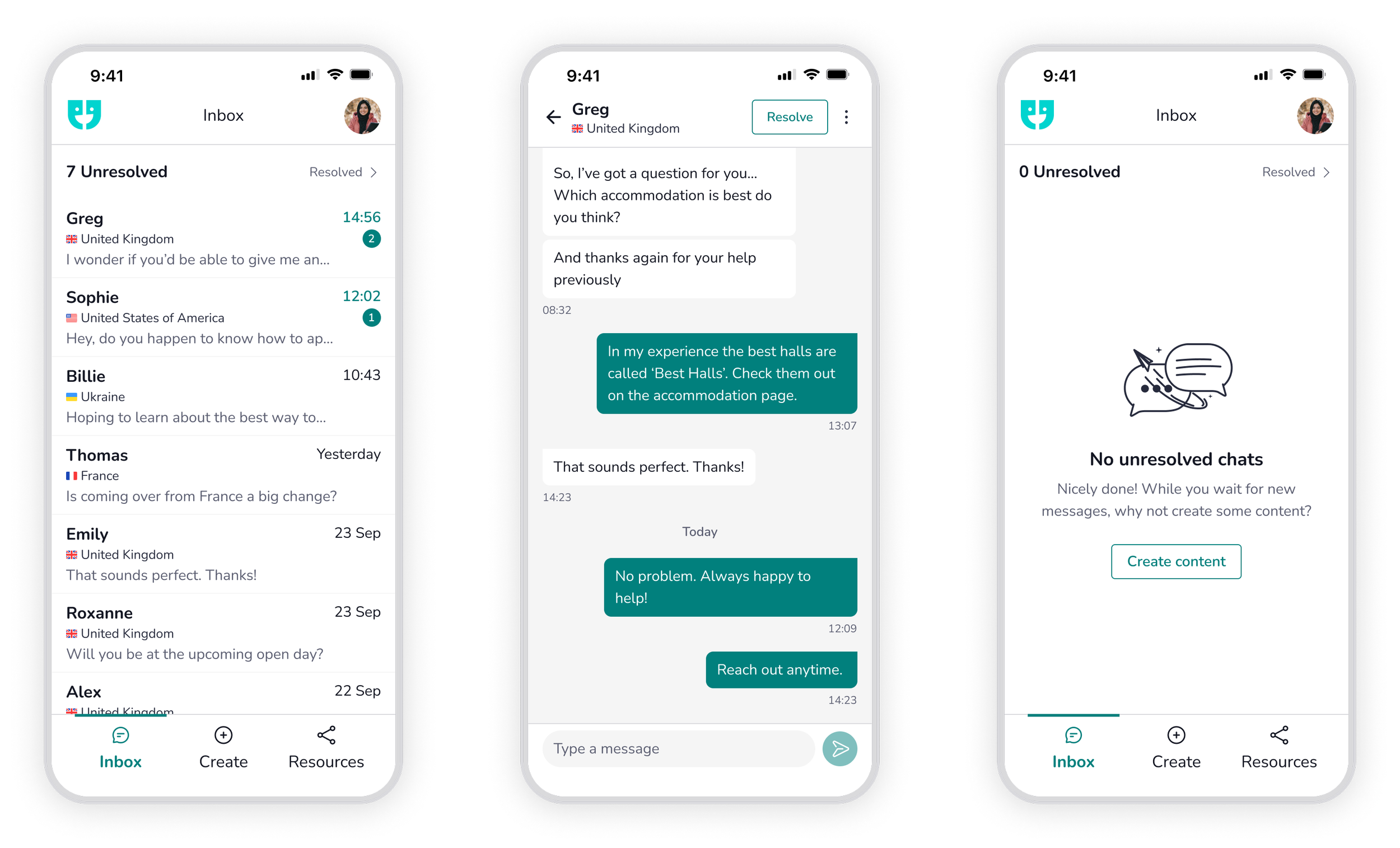
Resolved vs unresolved inbox
One of the first problems I tackled was how to separate active and inactive conversations. Ambassadors had no clear way to manage their inbox, and old messages were often mixed in with ongoing ones — leading to clutter and missed responses.
On the admin side of the platform, conversations are marked as resolved once they no longer need action. We wanted to bring a similar experience to the ambassador app, while also encouraging ambassadors to actively resolve chats. This would not only help them stay organised but also make it easier for admins to oversee performance and manage workload.
I explored multiple approaches to inbox structure and navigation. Below are two early iterations showing different ways of separating resolved and unresolved chats.

Content creation flow
A key flow I needed to design was how ambassadors would create content within the app. Initially, we planned to support both video uploads and article writing. The goal was to make this experience feel fast, intuitive, and low-friction — drawing inspiration from familiar platforms like Instagram and YouTube.

I explored several approaches to the content creation entry point. One early concept was a simple bottom sheet showing all available content types. This was lightweight and scalable, allowing us to easily add new options in the future.
However, we eventually leaned toward a card-based approach. While slightly more complex to build, it gave us space to include helpful context or examples — making the experience more informative for first-time users and easier to extend as new features were introduced.

Content/resource library
The content library was designed as a personal and shared space. Ambassadors could view and edit their own content, while also browsing content created by peers. This served two purposes:
Inspiration: Seeing what others were creating helped motivate ambassadors to contribute their own content
Discovery and reuse: Ambassadors could familiarise themselves with content that already existed, making it easier to share relevant pieces in conversations with prospective students
This area also laid the groundwork for more community-driven features in future iterations.

HI-FI DESIGNS
UI decisions
Using Unibuddy’s design system as a foundation, I made the decision to use our mint/teal color as the primary accent throughout the app. This choice gave the app a fresh, modern, and youthful feel — aligning with the ambassador audience — while also conveying calmness, trust, and inclusivity. As a gender-neutral and accessible tone, it helped ensure the app felt welcoming to everyone.
This also kept the app consistent with Unibuddy’s brand identity, while allowing the interface to remain clean and focused — prioritising function, clarity, and readability.
Visual elements throughout the app were designed by our in-house graphic designer, adding illustrations and icons that brought personality to the experience. These visuals helped users quickly understand each page and their available actions, while making the app feel more engaging and human.
Onboarding
To support both new and returning ambassadors, I introduced a lightweight onboarding flow. The aim was to familiarise users with key functionality and new features without slowing them down.
Some key moments included:
Highlighting the new swipe-to-resolve chat feature
Educating users on how to report inappropriate messages
Giving a quick overview of content creation and chat organisation tools
This flow helped drive faster adoption and reduced support questions post-launch.

Inbox & Chat
Building on the lo-fi explorations, I designed the inbox to clearly separate resolved and unresolved conversations. I borrowed interaction patterns from familiar apps like WhatsApp (e.g. their archive flow) to create a smooth and intuitive experience.
A prominent counter at the top displays the number of unresolved chats, encouraging ambassadors to stay on top of their inbox
This separation helps avoid confusion between unread and unresolved messages — making it easier to manage conversations effectively
After resolving conversations, ambassadors are nudged to create content — reinforcing that there’s always something meaningful to do within the app
The chat UI itself remained minimal, but carefully considered. I redesigned message bubbles and refined the display of timestamps and date markers to create consistency across platforms and improve readability.
Safety & blocking
Student safety is a top priority. As a result, I designed a flow for ambassadors to block and report users who were behaving inappropriately. The report flow allows ambassadors to provide a reason, giving admins important context for follow-up.
Although we plan to introduce advanced moderation features in the future (like chat transfers or content sharing directly from the conversation view), safety features were prioritised for this first release.

Content creation
Creating and sharing content is a core part of the ambassador role. But from our research, we learned that many ambassadors weren’t sure what to post or lacked inspiration.
While we explored more advanced ideas like using AI to suggest content based on past conversations and profile data, we opted for a simpler solution at launch:
A lightweight, welcoming UI for creating videos
Generic prompts and encouraging copy to help spark ideas and reduce friction
This approach gave us a fast, scalable starting point while leaving room for smarter suggestions in the future.

Resources
The Resources section allows ambassadors to manage and share both their own content and content created by their peers. This helps with two key goals:
Inspiration — seeing what others are creating encourages participation
Efficiency — ambassadors can easily reuse helpful content in chats with prospective students
While the long-term vision includes features like AI-suggested replies, shared links, saved answers, and admin tasks, the MVP focused on two core areas:
My content — a personal space to track and edit their own videos and articles
Peer content — a place to browse and share peer-created content
We used consistent visuals for both views to reduce development effort and maintain a cohesive look and feel.


Documentation
Clear documentation was essential to ensure a smooth handoff and reduce ambiguity during development. While most design decisions were captured directly in Figma using components, annotations, and page organization, I made sure to provide additional clarity where needed — especially in areas where interaction, layout, or platform-specific behavior might be misinterpreted.
Some things I documented:
Spacing and layout rules — consistent paddings, margins, and grid use across screens to maintain visual harmony
Component behavior — how components respond to different states (e.g. loading, empty, success)
Colour usage — applied our mint/teal palette with clear hierarchy and contrast guidelines, ensuring accessibility and consistency
Typography — defined font sizes, weights, and use cases to match our design system and maintain clarity across views
Microinteractions — explained how animations or transitions (e.g. swipe to resolve, onboarding flows) should feel, including edge cases
These details helped the engineering team deliver more efficiently and confidently, while also making it easier to QA during testing.

IMPACT
Bug-free relaunch: Delivered a fully rebuilt mobile experience that addressed long-standing technical issues and significantly improved user satisfaction
Stronger customer trust: Allowed us to re-engage with university partners and ambassadors confidently, sharing a clear message that we had listened to feedback and acted on it
Shift to mobile: Increased the percentage of daily active users on mobile, indicating a shift in preference from desktop to mobile
Faster response times: With more ambassadors using mobile, response rates improved — helping prospects get answers more quickly and efficiently
User satisfaction score of 8.2/10 post-launch
Zero complaints submitted about the new app after rollout
300% increase in ambassador engagement, measured by message volume and content creation